This is a document detailing the professional, educational work I’ve done over the 2 years of being in college.
Which includes the work I’ve done for the agency, the footage for Street Factory and the work I’ve done during my first and second year at college.
.jpeg)

I’ll be going into detail about the processes and developments that went into creating the work as well as the complications and strides that I encountered during the time creating them.
____________________________________________________________________________________________
Street Factory Professional Work
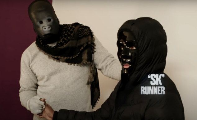
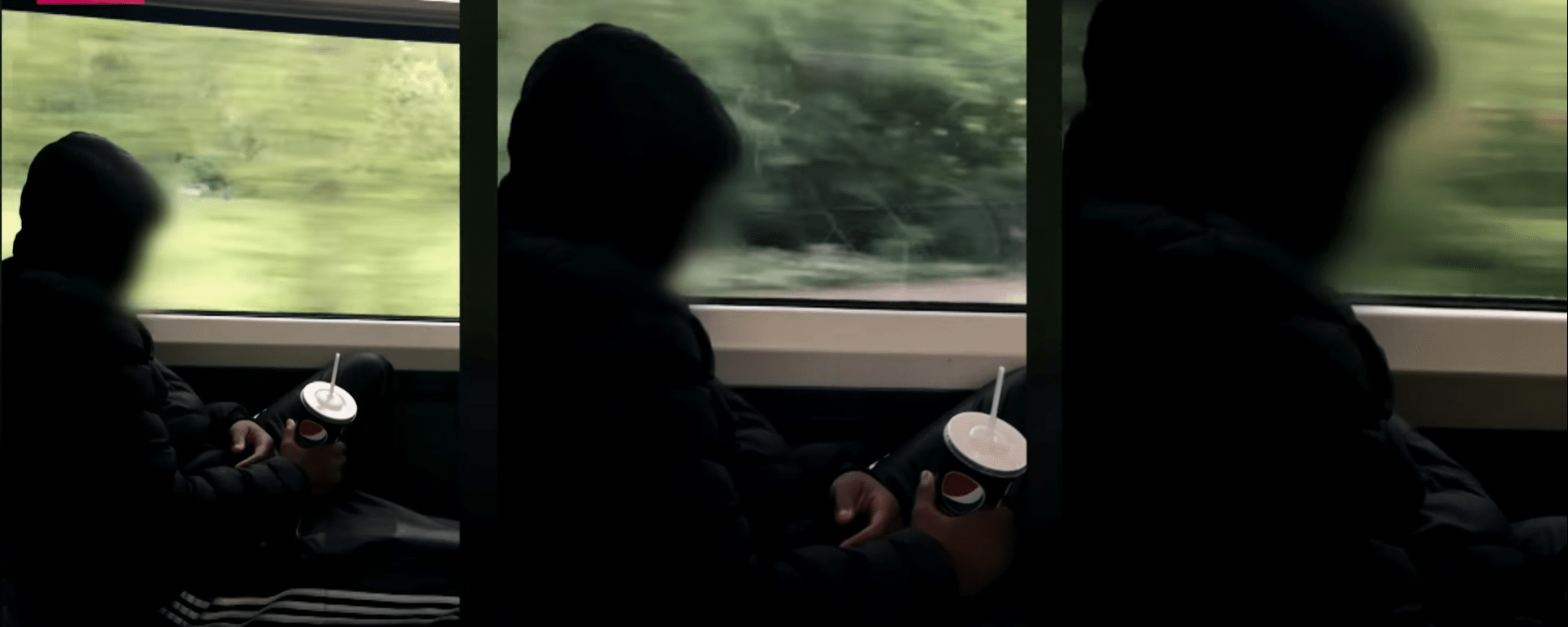
The Street Factory work was started in mid-July and involved me and two other students in a documentary style video aimed at promoting the up and coming renovation of their facility and getting to know the people in charge of the restorations.
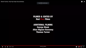
Me and my colleagues made individual B-Roll footage for the documentary titled “Hip Hop Hope”. We compiled our own clips into a full video to use as evidence if wanted
“Hip Hop Hope” will be shown at the debut of the building after its completed renovations.
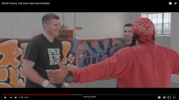
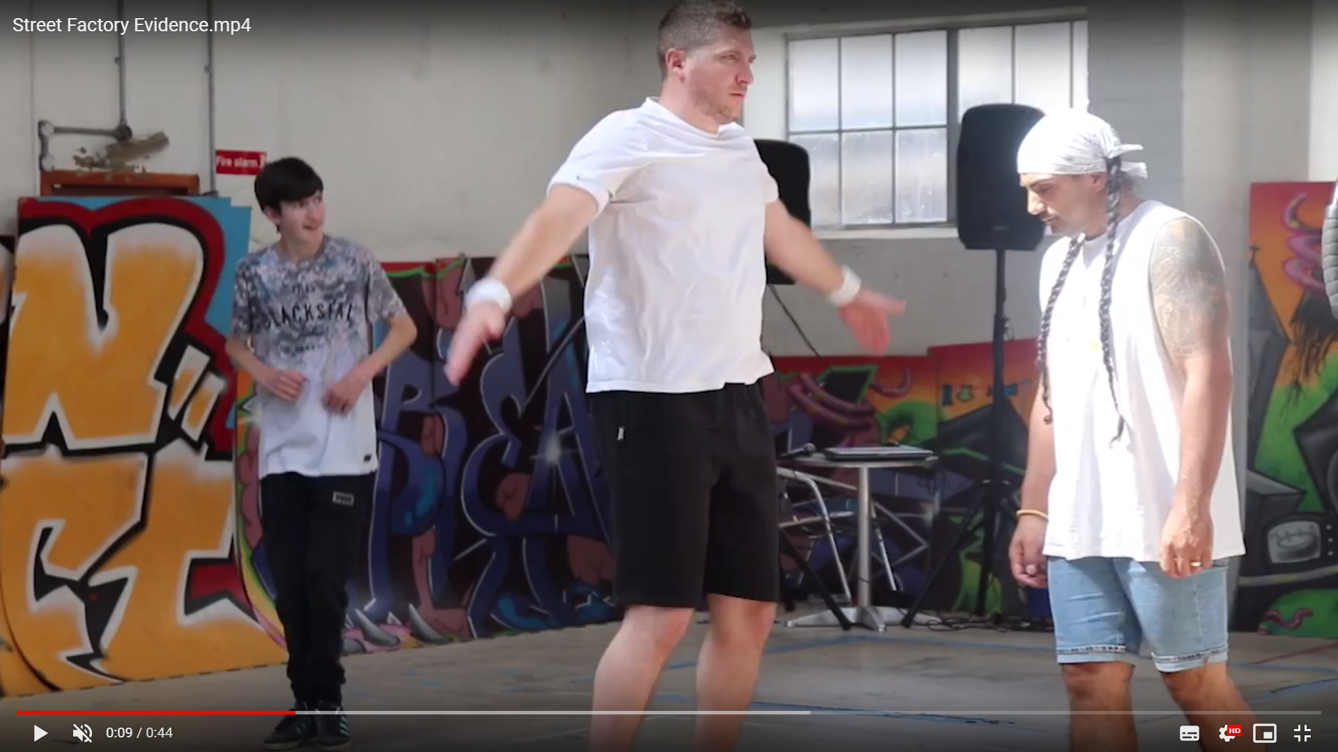
Overall Street Factory was a good first first step into professional filming as it wasn’t too challenging and allowed us to truly utilise our skills and knowledge that we’ve learnt during our time filming and learning. We filmed every Thursday for 8 weeks to gather the footage they wanted to use.
____________________________________________________________________________________________
Graphic’s Design Poster For the Agency
From mid-October to Christmas, me and 10 other students were hand selected to be involved in a college agency aimed to continue after many years of students have moved on, we are the first team of students associated with the college agency. Our first commission in the agency was to design a piece of media for Mt Tamar School, so I was in charge of creating a piece of digital graphic design, specifically a poster about the transition form school to later life.
So my project went through 3 major stages form the base idea to considerable progress and completing it with 5 different designs
In the end we went with the original edit I did first which was just evening haze poster, over the span of a week the poster was completed with information detailing to college and who to ask for help and as well to careers outside of institutions. After the media was completed it was sent off to Mt Tamar, Achieving our first paid commission. Once we finish our second year at college, the next second years will be controlling the commissions as the Agency. Years down the line as we’ve progressed in our lives we may be asked upon by the agency to do some activities and help with projects and commissions with the newest second years, I look forward the agency at its peak in the near future.
____________________________________________________________________________________________
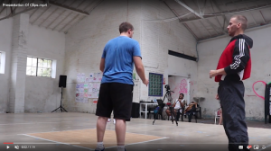
My Show-reel of Videos
From Year 1 to Year 2, the compilation of clips of my favourite and most creative work.
Personally I wish I had better footage as their quite short and require a bit of context however they work to their effect and I know it shows the extent of what I can do. The show-reel highlights 8 works of both individual and professional projects I created or was involved including class videos and graded assignments. They span from the second month of my first year to September of 2018 in my second year.

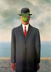
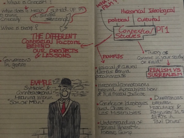 more of something to be thought upon and analysed at a later date however I did want to add a different form of media that could be used in Contextual Study so I particularly chose the painting Son Of Man because of its surreal art aspect and non-sensical symbolic meaning this goes for most of Rene Magritte’s artwork including Golconda and The Lovers
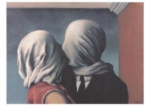